The Game Station

A solution to Live Service Game Management.

Where

What

Why

Saitama, Japan

SaaS

Porfolio Project

Role

Category

When

Designer, Researcher

Management, SaaS

Jan 2023 – March 2023

Why I made this project

I enjoy live service games. So I thought it would be a good idea to help out with the organization and management portion for the developers with this SaaS.

Market Research

The Claim

The SaaS market has been steadily increasing within the last 10 - 12 years. It’s estimated to be worth about $197 billion and could reach about $232 billion by 2024.

What's the problem?

The overall cloud service market may begin to decline with increase growth of cloud platforms and infrastructure services.

Competitive analysis

I analyzed various popular management SaaS apps, but I chose 3 that stood out to me the most. I looked through the negative reviews to see any patterns that I could find.

Productiv

The good

The integration between Productiv and other apps is done quite easily and smoothly. It’s often praised by customers.

The bad

Productiv is a great management SaaS, but it’s also too overwhelming, especially for newer people. Learning curve is a bit high.

Zylo

The good

A common praise I often see with Zylo is that it is showing cost and usage of the SaaS solutions.

The bad

Although it is a great SaaS management app, integration seems to be a common negative review.

Cloudeagle

The good

CloudEagle has had many positives going for it, but most notably is its smooth and easy onboarding.

The bad

What I’ve noticed is that the pricing can be made a bit more affordable and it can also do a bit more integration, too.

Problems from the comments

User Survey

I made a quick survey on social media with people who are interested in or currently using any kind of SaaS products.

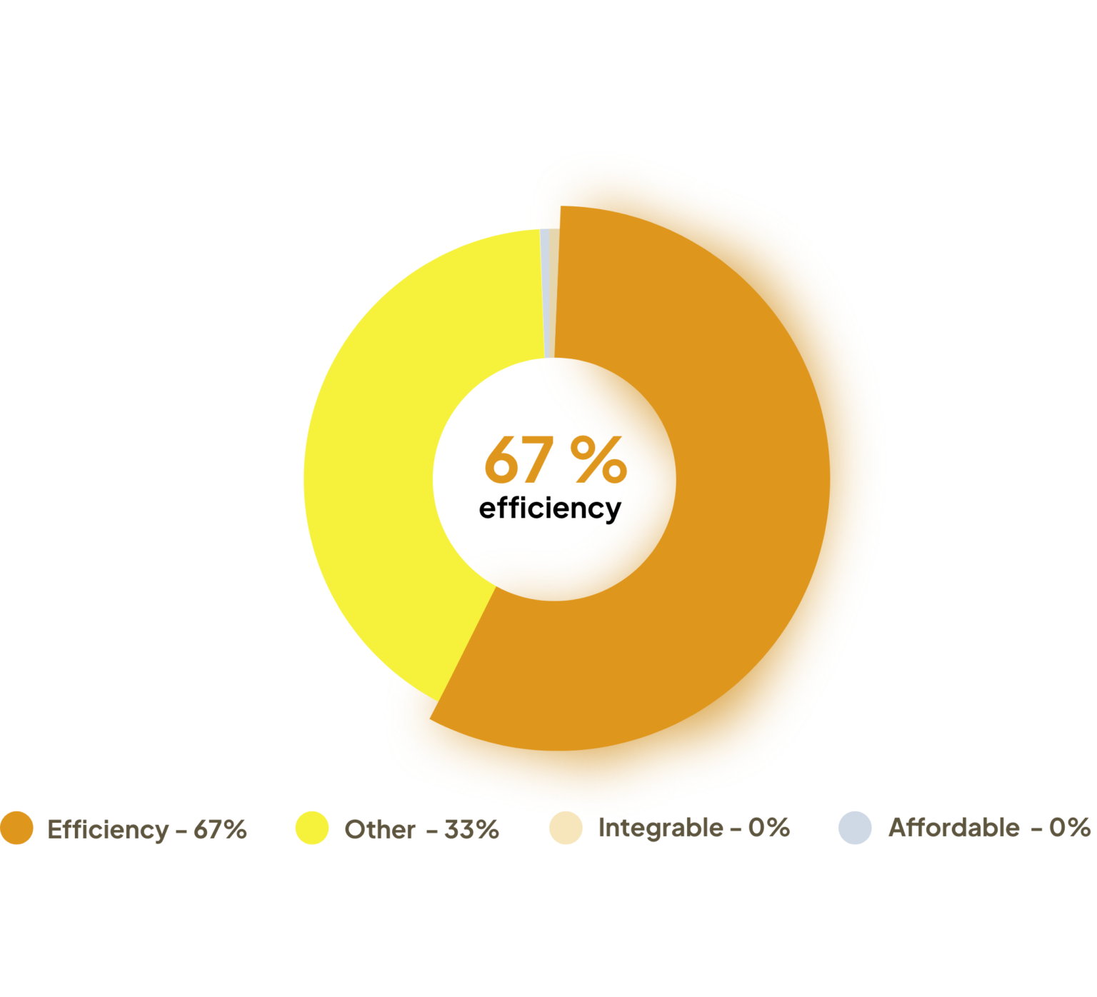
Which benefits you the most from a SaaS product?

9 participants

Notable comments

What the research says

There is a growing need for electronics that are well-made, good quality with the price being not overpriced for the quality that you are receiving.

Personas

I created two personas for this SaaS app based on two types of users. The first one is the business owner and the second is the client.

Let's get to work!

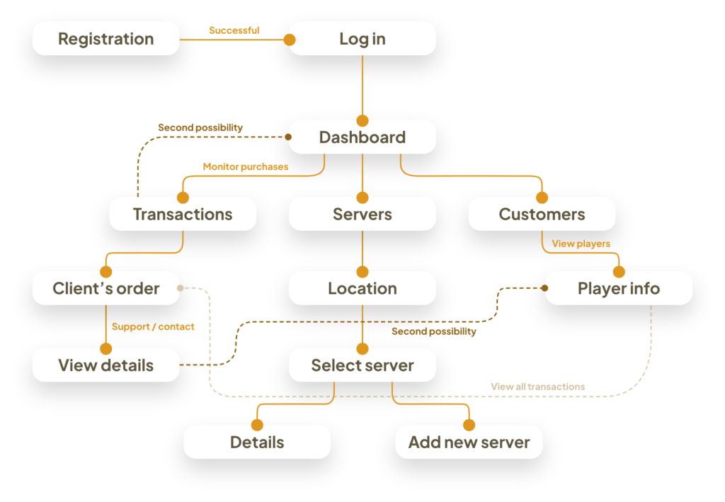
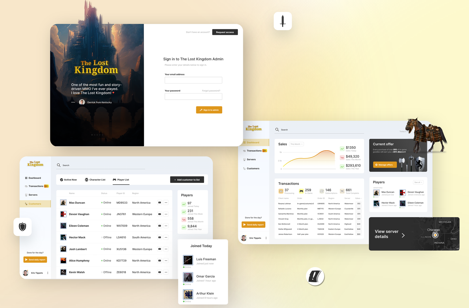
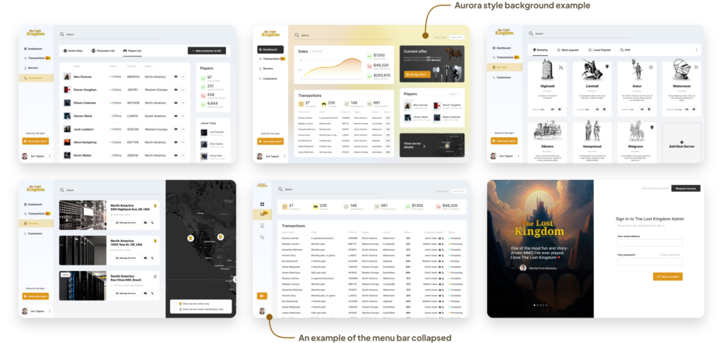
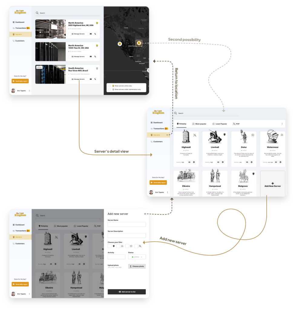
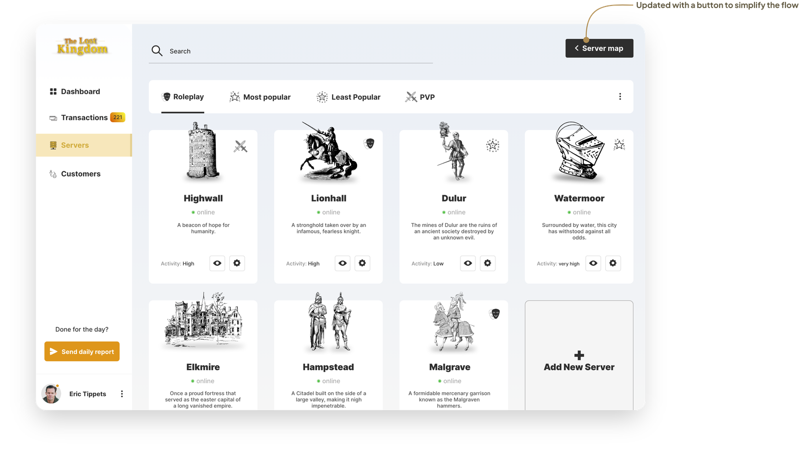
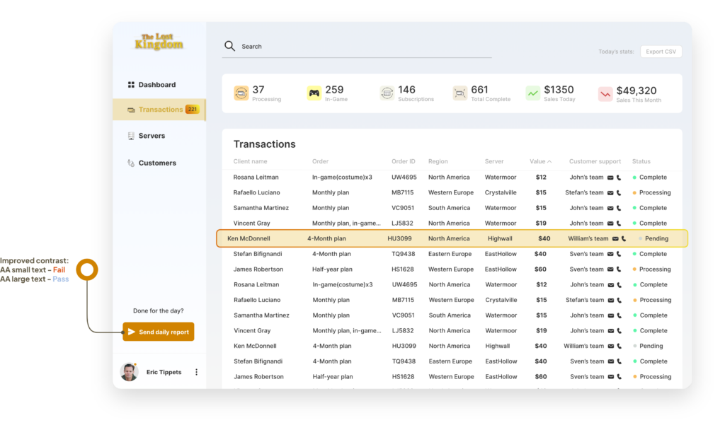
After I looked through all my research data, it was then time to begin designing. I started with sketching out my ideas with the first flows and the initial low-fidelity wireframes.

Flow Diagram

To show all the basic and necessary functionality of this SaaS, I have created a simple flow diagram of the main tasks the user can do. One of the flows is shown below. The fail state flows and other possibilities were also created, but not shown because of spacial constraints.

Main Client Flow

Lo-Fidelity Wireframes

After the flow diagrams were finished, I began to create the low fidelity wireframes of the main flow through a series of sketches.

High-Fidelity UI Design

Once the main flow was finished, I started creating a couple of the main screens of this app. I initially began by defining the colors and fonts.

Font

Inter

Regular, Medium, SemiBold, Bold, Black

AaBbCcDdEeFfGgHh

Color palette

Accent 1, Accent 2, Primary,

Secondary, Tertiary, Background

Modern & simplistic feel

The style was done by using decorative PNGs/JPGs related to the game in simplistic ways. I made basic buttons and most icons, too.

13 high-fidelity designs were made

Also including two different navigation patterns (a side bar and a collapsed menu bar) that could be explored and experimented for an A/B testing in later design stages of the SaaS.

During my testing, I was trying out simple and plain white backgrounds, soft pale light blue background and an aurora-styled blurred background with various screens throughout the high-fidelity stages. I was going for a very simplistic & modern feel.

Alignment and grid

I chose an 8-point grid for this project and set the margins for within groups at 8, 16 and 24. Margins between groups were set at 24, 32, and 40.

High-fidelity prototype

I have linked my high fidelity designs into a clickable prototype. This will let me to do a first round of testing on a first group of users of this SaaS.

Prototype validation

My prototype was validated by 4 users of my SaaS app. Each of the users were given a simplified version of the main flow prototype design. It’s dedicated in completing a successful navigation between the categories. I wanted the make it straightforward and simple to use for anyone.

I had this tested out in-person where I introduced this SaaS product to the users and asked them questions about it. I asked some questions that were dedicated to finding out whether if the navigation within the categories is easy enough to successfully go through various screens.

Study results

75% of users (3 out of 4) were unaware that you could click on the servers tab on the navigation bar in order to go back to the server map. They weren’t able to leave screen with the grid view of the servers easily. That means that the success rate of this task was just 25%.

prototype update concept

Because of the time constraints, I wasn’t able to do a second round of usability study on the updated prototype. However, I did update it by adding a “server map” button at the top-right of the page with an arrow signifying to go back.

Accessibility check

This SaaS has been evaluated to have the proper contrast in order to meet the accepted AA standards of WCAG. In some areas, I found that the contrast could be improved.

One example was the main CTA button I designed at first. I wanted to differentiate this button from all others while keeping one of the main colors of the Logo. The orange was good, but it wasn’t proven to be accessible. I adjusted the contrast on the final version of the background color.

Project summary

During my project, I had to evaluate the market for my SaaS. At first it was hard because I had I wasn’t sure how to do the research, but I figured it out. I also did some quick user surveys on X(Twitter), performed in-person short usability study, creating some lo-fidelity wireframes and high-fidelity designs, and make a SaaS prototype flow.


I also did a QA audit so that I could improve my accessibility with color contrast and consistency.

I thought that working on a SaaS product was a bit more challenging, however I learned a lot with this project such as doing market research for SaaS. Even producing a competitive analysis taught me a lot about researching competitors.