Why I made this project
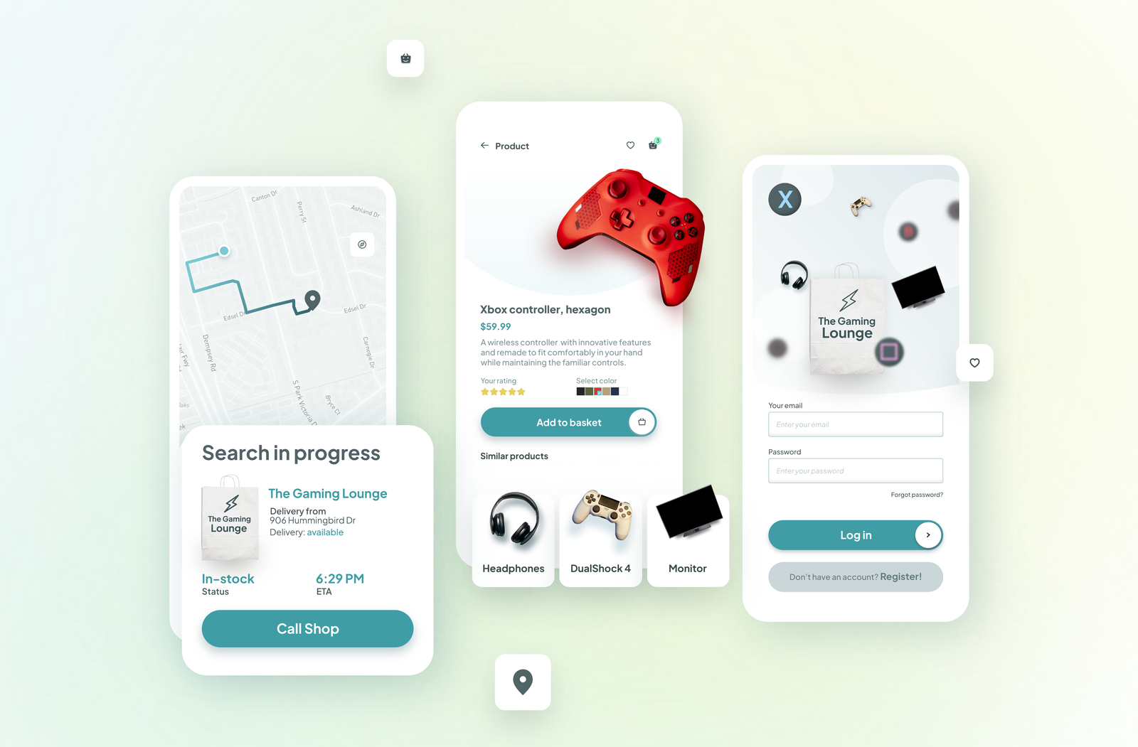
I’m a huge fan of all things involving video games. This app’s purpose would make shopping for games or gaming items very easy and allows people to easily find and order from local shops around them.
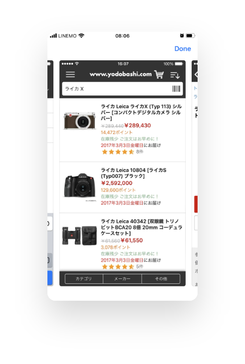
Yodobashi
GEO

Bic Camera

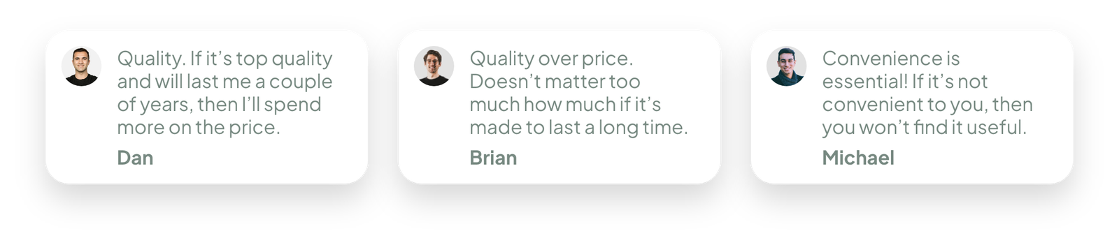
What's the most important factor you take into account while shopping for electronics?
15 participants


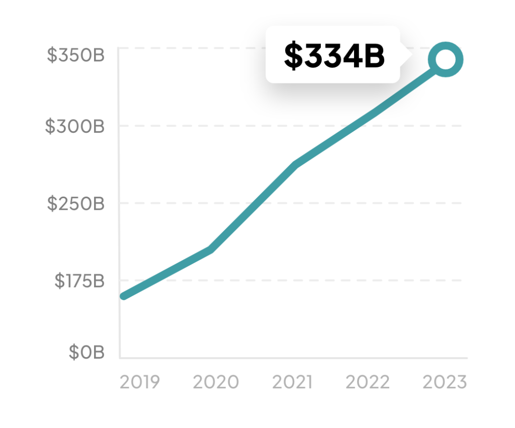
The research shows
There is a growing need for electronics that are well-made, good quality with the price being not overpriced for the quality that you are receiving.

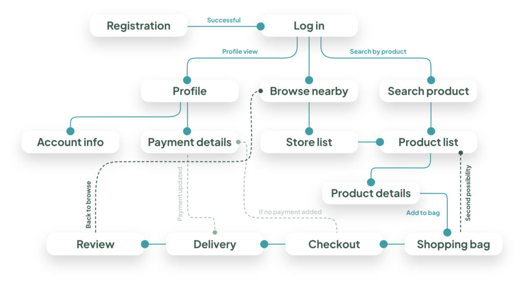
Let's begin designing!
Once I went through all my research data, it was time to start sketching out my ideas with the first flows and the initial low-fidelity wireframes.